Southern Innovator Down Under: Two Scandinavian Designs Meet | 19 March 2014

Southern Innovator took a brief detour to Australia in November 2013 and couldn’t pass up the opportunity to visit the iconic Sydney Opera House. Designed by legendary Danish modernist architect Jørn Utzon in the 1950s, the project was plagued by controversy and conflict as its design was considered too radical. An excellent book (pictured below) details the conflicts with politicians and the general public and how the design went from being despised, to an Australian architectural landmark. Utzon’s design was selected after a global competition for concepts and was radical outside and in. Using innovative construction techniques in order to create the billowing sail effect of the complex, it was also a pioneer in green architecture inside (though much of the original plan was not entirely fulfilled). For example, it uses passive heating and cooling technologies throughout and draws on plentiful sea water surrounding the building to cool and warm the public spaces. During my visit, there was an exhibition of Danish design in the lobby, placing Utzon’s work in the wider context of Danish modernism and its connection to social and green design. The Opera House also has an outstanding gift shop with many opportunities for budding architects and designers to learn more about the building (and buy Lego kits to take home!).
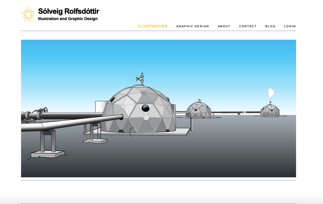
Southern Innovator is designed by graphic designer Sólveig Rolfsdóttir in Iceland and has tried to be as innovative in its design and production as the people we feature in the magazine. The energy used by the designers to make the magazine comes from 100 per cent renewable energy sources in Iceland. The paper the magazine is printed on is from renewable forest resources. As much of the content as possible is sourced directly from the global network of innovators in order to avoid duplication of resources when it comes to photographs. The magazine is deliberately kept to 60 pages to lower its weight. It uses a larger text font size than would normally be used in commercial magazines in order to aid people with visual impairment or who are reading the magazine in low-light conditions. The binding is designed to be robust and we expect the magazine to receive a fair bit of abuse on its journey to reach readers. The cover is laminated so that dirt and water can be repelled and the magazine quickly wiped clean. The graphic design is purposefully kept simple in order to reach as a wide a group of readers as possible. We hope we have stuck to some of the core principles of modern social and green design when creating Southern Innovator. And that its content is also another masterpiece of human creativity!
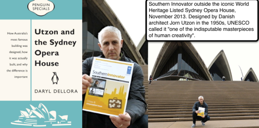 Southern Innovator Editor David South at the Sydney Opera House in 2013. Photos: Jill Lawless


© David South Consulting 2017
 21st century, David South Consulting, Digital, GSSD, GSSD Expo, Health and Human Development, ICT4D, International Development, Knowledge Sharing, Media, Millennium Development Goals, Mobile Phones and Information Technology, Mobiles, Reverse engineering, Southern Innovator, Sustainable Development Goals, UNOSSC, Youth